[Python.Seaborn] Predefined Plots 4 - FacetGrid, Map, PairPlot, LMPlot
2021. 2. 15. 05:00ㆍPython과 머신러닝/MatPlotLib 데이터 시각화
0. 이전 포스트
- 2021/02/06 - [Python과 머신러닝/MatPlotLib 데이터 시각화] - [Python.Seaborn] Predefined Plots 1 - Box Plot, Violin Plot, Swarm Plot
- 2021/02/10 - [Python과 머신러닝/MatPlotLib 데이터 시각화] - [Python.Seaborn] Predefined Plots 2 - PointPlot, RegPlot, subplots
- 2021/02/11 - [Python과 머신러닝/MatPlotLib 데이터 시각화] - [Python.Seaborn] Predefined Plots 3 - Predefined Multiple Plots - RelPlot, CatPlot
1. Facet Grid - Histogram
In [33]:g = sns.FacetGrid(tips, col='time', row='smoker') #2x2 graph 그리기
        g = g.map(plt.hist, 'total_bill') #각 분류별 total_bill의 histogram
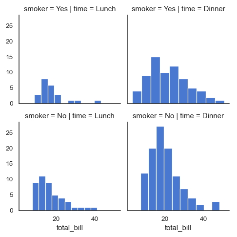
- Facet Grid란 쉽게 말해 Multi plot이라고 이해하면 된다.
- 즉, 하나의 데이터를 여러 개의 plot으로 나눠서 보고자 할 때 사용된다.
- 위 예시는 row/col을 나눠서 흡연자 여부와 점심/저녁 여부에 따른 총 식사 비용의 histogram을 보여주고 있는 것이다.
- tips 데이터를 column은 time을 기준으로 구분하고, row는 smoker를 기준으로 구분하여 plt.hist(histogram)으로 표현하라는 의미이다.
2. FacetGrid - Scatter Plot
In [34]:g = sns.FacetGrid(tips, col='time', row='smoker')
        g = g.map(plt.scatter, 'total_bill', 'tip', edgecolor='w')
- 이번 예시도 1번과 동일하게 row/col을 smoker/time으로 구분하였다.
- plt.scatter : 데이터를 분포 그래프로 표현하라
- 'total_bill' : x 축에 total_bill 변수를 사용
- 'tip' : y 축에 tip 변수를 사용
- edgecolor='w' : 각 점의 테두리를 흰색으로 설정
3. FacetGrid - 선형 그래프 (plt.plot)
In [35]:att = sns.load_dataset('attention')
        g=sns.FacetGrid(att,
                        col='subject',
                        col_wrap=5,
                        height=1.5)
        g = g.map(plt.plot, 'solutions', 'score', marker='.')

- 이번 예시는 Col만 지정했지만 종류가 20개가 되기 때문에 col_wrap=5로 지정하여 한 줄에 5개씩만 표현하게 지정했다.
- att : Seaborn의 attention Dataset 사용
- col='subject' : subject를 col 구분자로 지정
- col_wrap=5 : 한 column에 5개씩 하고, 6개째부터는 다음 row에 그리기
- plt.plot : 각 그래프를 선형 그래프로 그리기
- 'solutions' : X축 데이터
- 'score' : Y축 데이터